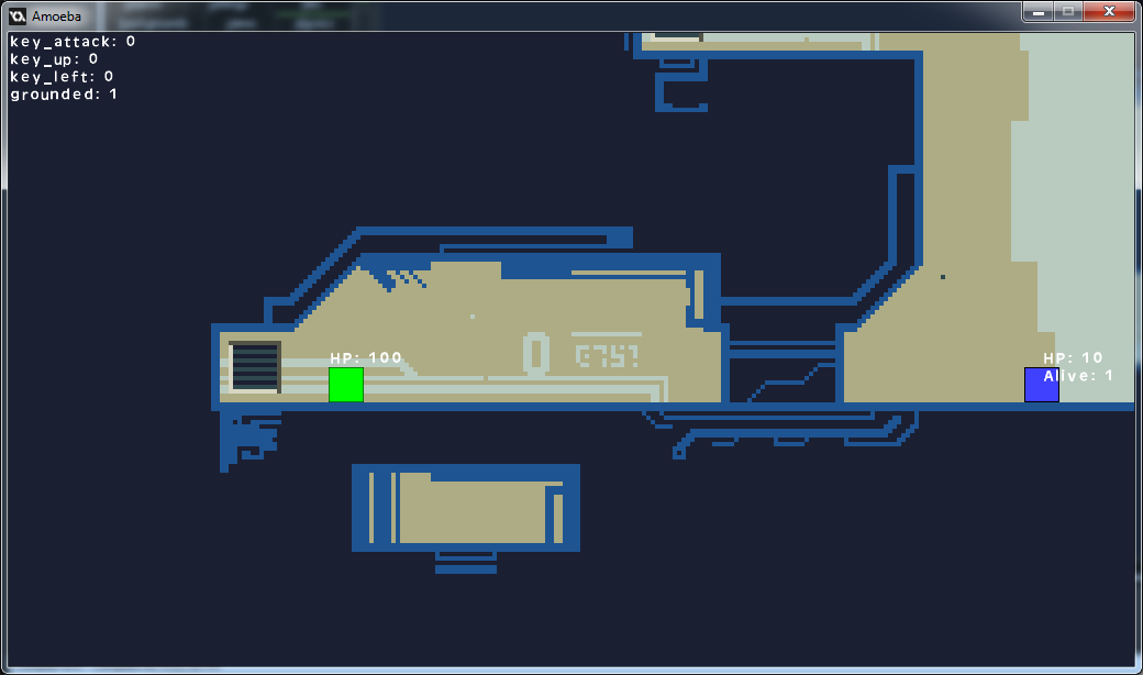
I've been doing a lot of work on the art style of Amoeba now that my game engine has a working skeleton. This is far harder for me than any of the programming work, or even game design. As an engineer I understand the processes used in both of those tasks. I am not a graphic artist, and I have only basic training in the principles and processes used, especially when it comes to pixel art.
I've struggled to try and get even a basic representation of the game that communicates the style, mood, and sense of place I want Amoeba to have. I'm learning a lot as I go, but it's slow and can be very discouraging when I put in a lot of work but feel as though I've accomplished nothing.
Here is a sample of the art so far:
I feel happy with the "style" - the camera projection, the shape of the character silhouettes, the pixel scale, etc. However I have particular trouble selecting color pallets. I get the basic idea (I think) but my lack of experience is really getting in the way. I have an idea in my head of how I want the scene to look, but when working on pixel art the coloring of individual pixels is sometimes really unintuitive.
Take this example from user "Helm" at pixeljoint.com (http://www.pixeljoint.com/pixelart/76179.htm):
Take a look at individual pixels, especially the highlights and shadows. You'll notice bright cyan, purple, and deep greens for a scene that takes place in a metallic hangar that in "real life" would probably just be grey. Obviously though, if you look at the whole scene, the color palette works very well, communicates depth, age, and mood very well.
Although I'd like to learn how to do this properly, eventually I think I'll seek out a "real" artist to help me polish off Amoeba. In the mean time I'm just plugging along trying to learn as much as I can and refine what I have as much as possible.
Onward!


